Get Table |
Click icon to create Tables of various statistics and indicators. |
|
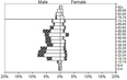
Get YPLL Pyramids |
Click icon to create Pyramid Charts of the Top 10 leading causes of Premature Death (measured by Years of Potential Life Lost (YPLL)). |
|

Get Map |
Click icon to create Maps by County, Region, or sub-county areas such as Census Tract. |
|
Get Dashboard |
Click icon to create a single report of the Top 15 causes of death, hospital discharge, or ER visits. Reports include trends and maps for each cause. |
|

Get Animated Pyramids |
Click icon to create Animated Pyramid Charts that show the age / race / sex distribution of counts or percentages, including associated data tables. |
|
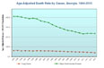
Get Trends |
Click icon to create Line Charts to show trends of indicators over time; including associated data tables. |
|
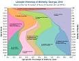
Get Lifespan Histomap |
Click icon to create Lifespan Histomaps of mortality based on the top 10 causes of Premature Death (measured by Years of Potential Life Lost (YPLL)). |
| |